When you're an ad geek, your internet wandering means that you regularly stumble across websites where you get to see campaigns in their entirety.
Seeing all the ads in the series, side by side, allows you to evaluate the series as a whole.
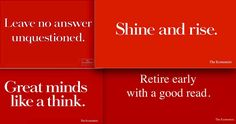
Which is why I was recently reminded all over again that The Economist's advertising represents one of the finest branding exercises of my lifetime.
Different writing disciplines may call for different styles but one that transcends all genres is the gift for conveying maximum impact with minimum words. Raymond Chandler, creator of the prototype private eye Philip Marlowe, was a master of this, requiring just six words to hand the consummate image of an ugly face to his readers in The Little Sister - 'It could stop a runaway horse'.
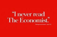
The writer and designer behind The Economist campaign showed that same gift. Unafraid to credit their readers with enough intelligence to join the dots, they married up a simple trifecta of a red background, white lettering and a subtle nod to the divide between informed and uninformed. (The full text in the bottom example incidentally - my favourite - says, '"I never read The Economist." Management trainee. Aged 42'.)


It reached the point where you only had to be able to see the red and the white print to know the product. Branding nirvana.
And yet to my astonishment, I have just seen it bettered.
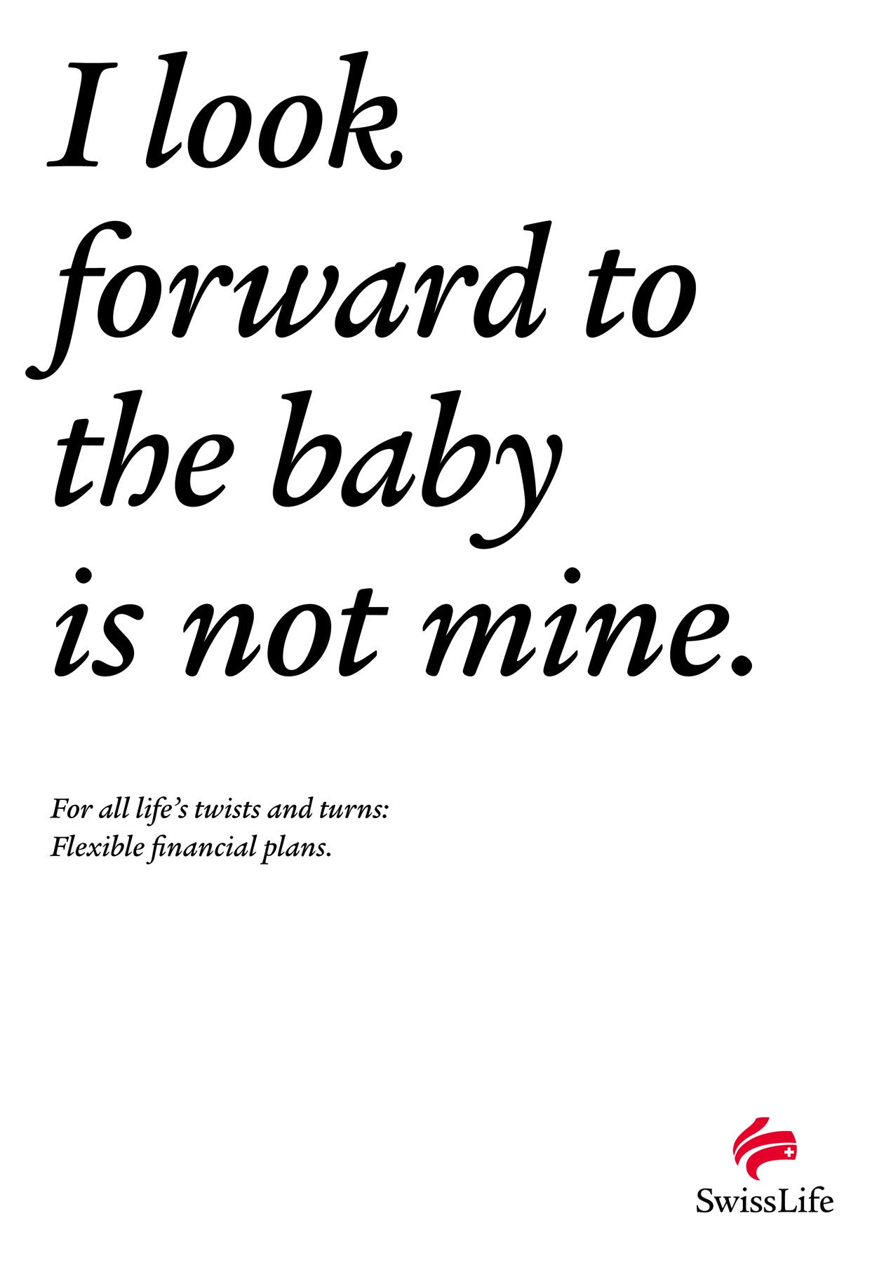
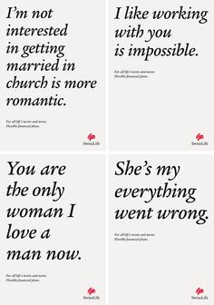
At the same time as I reacquainted myself with The Economist ads, I came across some for Swiss Life Asset Management. To mirror the sales pitch of financial planning for all life's twists and turns, they came up with a headline consisting of a single sentence that flip-flops halfway through; so...

This edges it for me, not only because the headline captures those 'twists and turns' so deftly but because so many people will have smiled knowingly (and maybe ruefully) as they read it.
These ads speak directly to their readers' pain, while The Economist ads (with this exception) just show off, albeit brilliantly.


